ATeam Website - Redesign Business Tech IT
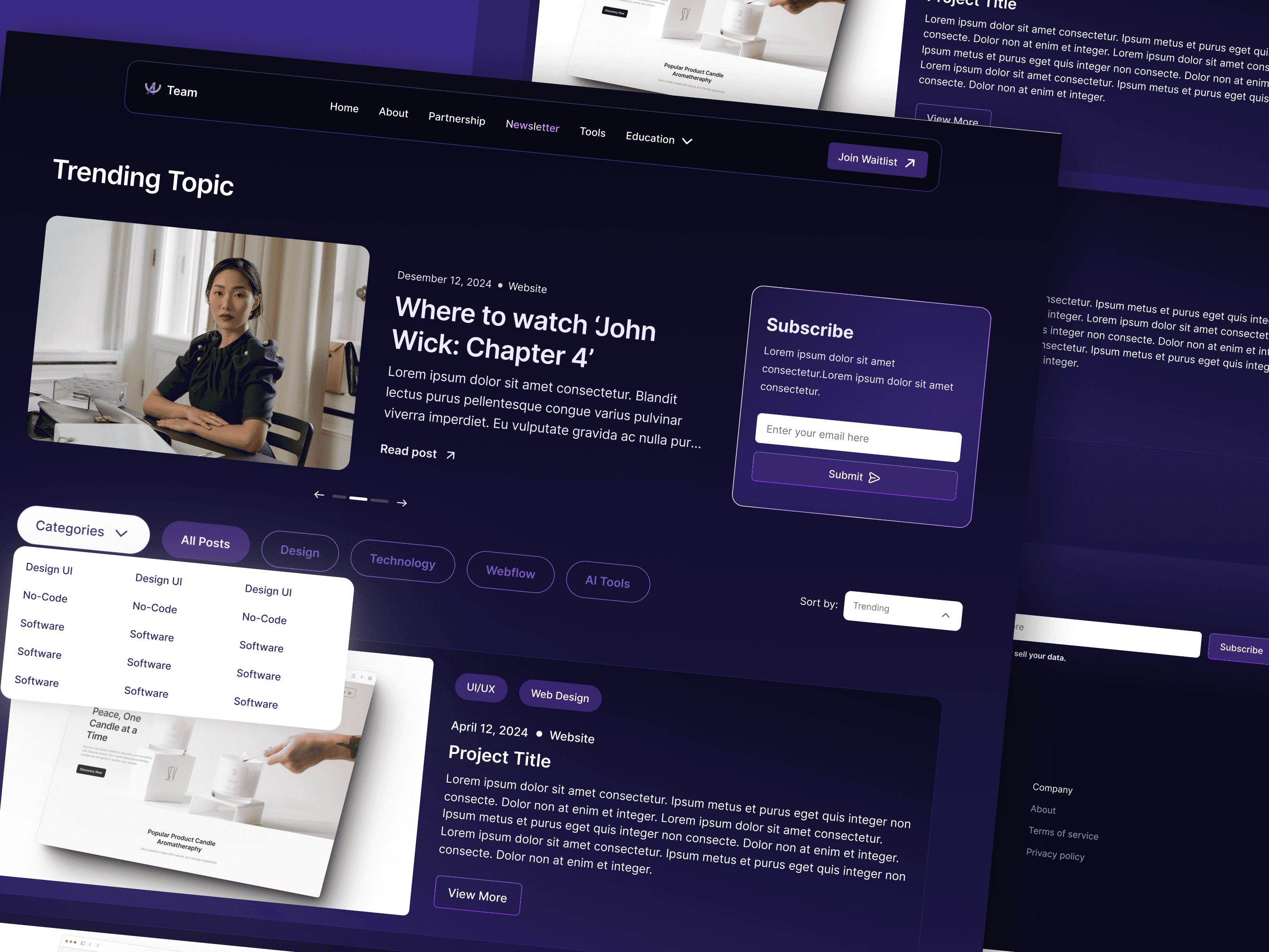
A-Team Website is a redesign project created to elevate the digital presence of a Tech IT Consultant brand through a cleaner, more credible, and professionally structured website experience.
Project Team


About the Real Project
A-Team is a redesign concept for a business website in the technology and IT consulting space. The project was created to help the brand present itself more professionally and communicate its services in a clearer and more effective way.
For service-based businesses in the tech industry, a website plays an important role in shaping first impressions. It needs to feel reliable, modern, and easy to understand — especially for potential clients who are looking for expertise and confidence before making contact.
This redesign was built to create a more polished and structured website experience while maintaining a clean and approachable visual identity.
Client
William
Industry
Tech IT Consultant
Platform
Website
Service
Web Development
My Role
UI Designer
Duration
1 Weeks
Challenges & Constraints
The existing website lacked a clear structure and strong visual hierarchy, making it difficult for visitors to quickly understand the company’s services and value proposition. In a competitive tech and IT consulting space, this created a weak first impression, reducing trust and potentially causing users to leave before taking action. The design also felt outdated and inconsistent, which did not reflect the brand’s level of expertise or professionalism.
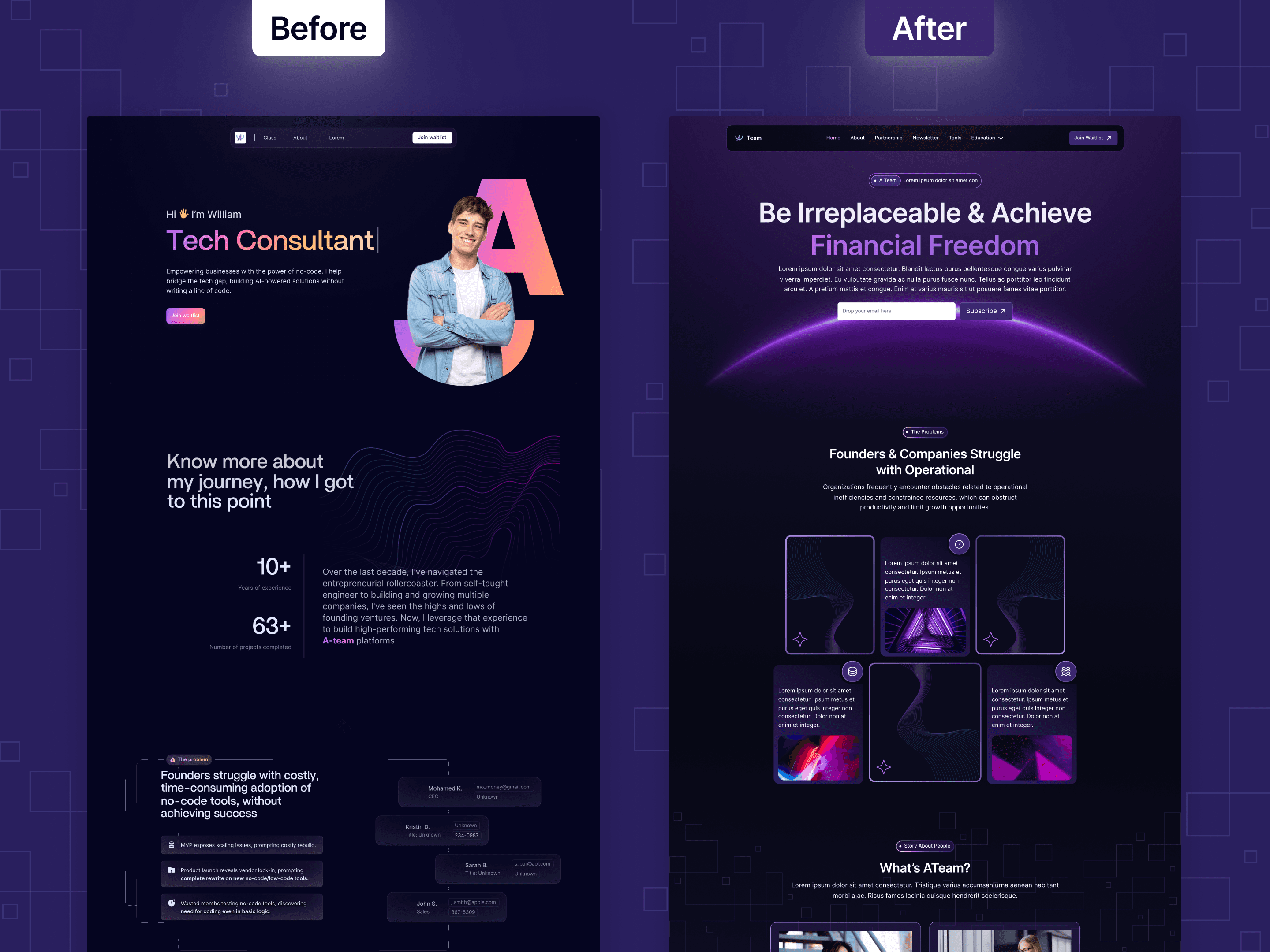
The goal of this redesign was to create a more modern, structured, and user-friendly website that clearly communicates the company’s services and builds credibility from the first interaction. By improving layout clarity, visual consistency, and content hierarchy, the new design aims to enhance user understanding, increase trust, and guide potential clients toward taking meaningful actions such as inquiries or consultations.
Quis quis non elementum felis adipiscing mauris. Etiam in non nibh id bibendum sodales. Aliquam enim imperdiet auctor curabitur ut volutpat. Ac gravida tortor platea id quisque pulvinar nec mi pretium. Sollicitudin sed id arcu nunc ut. Imperdiet lobortis in urna posuere ipsum. Scelerisque ac cras eu velit. Quam nec velit sed facilisi at consectetur varius blandit diam.
Pulvinar sodales quis cursus neque dignissim dolor. Leo diam viverra a vel ac. Dolor eget in tincidunt dui nulla euismod. Nibh posuere nulla consectetur mauris sed faucibus. Amet tincidunt ac justo nibh platea arcu sed ut. Tellus sed lacus tincidunt nec tristique amet. Dui metus suspendisse curabitur at arcu fermentum et fames. Imperdiet in felis platea maecenas phasellus. A non sed felis eget. Pellentesque habitasse mattis turpis sed sit non nunc praesent viverra. Enim nunc ut ultrices sodales odio. Posuere arcu imperdiet nisl aliquam. Dictum semper turpis et elit euismod. Arcu leo at urna eget ac rhoncus. Lorem mattis maecenas ut neque.
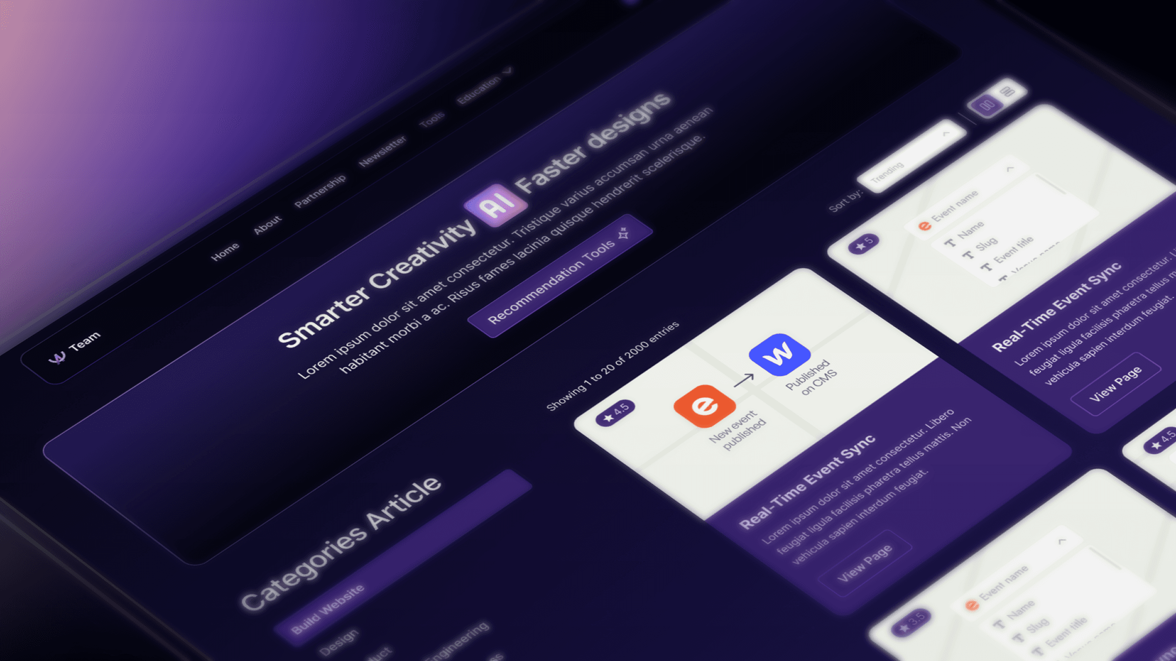
Dictum faucibus purus urna dapibus bibendum pellentesque eget id. Ac orci magna fermentum mattis id vestibulum semper. Lobortis dolor vel turpis et tellus tempus. Sed pretium cras sem eget ut sed enim sit. Sapien condimentum tellus quis orci aliquet et maecenas eleifend. Duis suscipit porta dui aliquam in pulvinar mattis. Leo tortor vel massa lorem praesent feugiat dolor aliquam gravida.
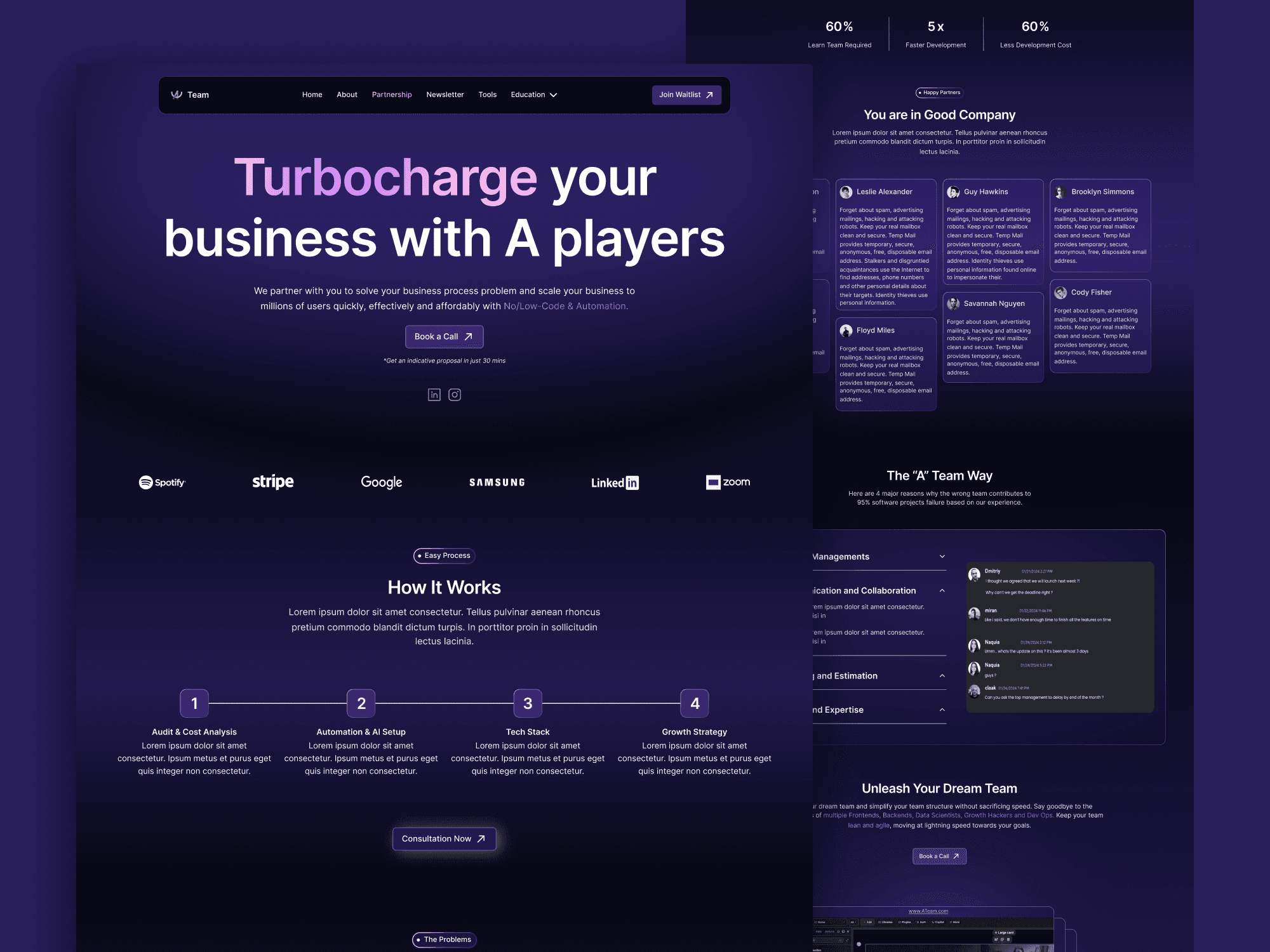
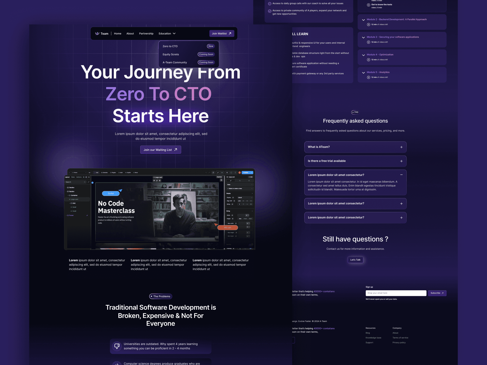
Showcase ATeam Website
Dictum faucibus purus urna dapibus bibendum pellentesque eget id. Ac orci magna fermentum mattis id vestibulum semper. Lobortis dolor vel turpis et tellus tempus. Sed pretium cras sem eget ut sed enim sit. Sapien condimentum tellus quis orci aliquet et maecenas eleifend. Duis suscipit porta dui aliquam in pulvinar mattis. Leo tortor vel massa lorem praesent feugiat dolor aliquam gravida.
Brand Colors
A consistent color palette ensures a cohesive user experience.
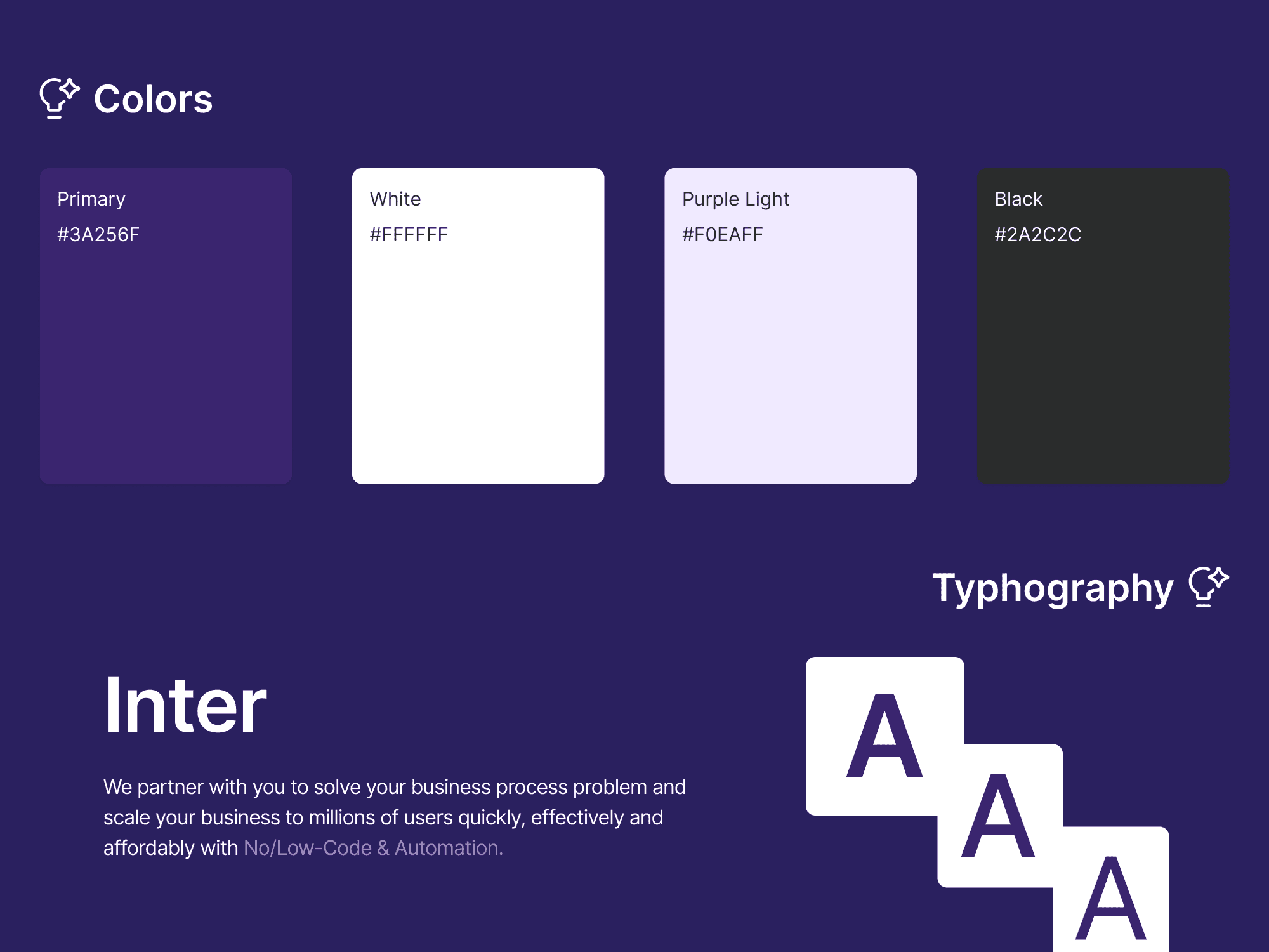
The visual design is built on a consistent color system and a scalable typography system to ensure clarity, accessibility, and strong visual hierarchy, and this combination is chosen to project a brand image of "modernity and technical reliability." The purple tones suggest a sophisticated, high-end service, while the Inter typeface ensures maximum clarity and a professional 'SaaS' aesthetic, making complex automation feel simple and accessible.
Get in contact with me.
Any interesting this design to work on?
Let’s work together. Don’t hesitate to discuss it with me, a cup of coffee would help my brain to work.